A vertical header in WordPress gives your website a stylish and innovative look. As a beginner, you might face some difficulties while developing your first design, but worry not; let us help you with your journey.
Now, in order to create a vertical header in WordPress, you must be familiar with the Elementor editor and Theme Builder. By default, WordPress gives a block editor or Gutenberg editor, which can also be used for developing vertical headers.
Vertical Header in WordPress: Using Elementor Editor
Using the Elementor editor gives you an edge when it comes to design and development. It is really easy to use, especially when it comes to custom functionalities and CSS properties.
With Elementor, we are going to use Theme Builder in order to create a vertical header in WordPress website. In order to access Theme Builder, you can hover over the ‘Templates’ and select ‘Theme Builder.’
Watch our video on “How to Build a Vertical Header in Just 5 Minutes” on Quiq Skill.
1. Create a new template for the header.
Once inside the Theme Builder screen, click on the header section and create a new header. Rename the template to something relevant, like “vertical header in WordPress,” so that you can identify templates easily inside saved templates. Once you are done with this part, you will get a blank canvas for creating your design using the Elementor editor.
2. Designing a vertical header and its properties.
Once you create a template for the header, you will get a blank canvas where we will put our logic for the vertical header.
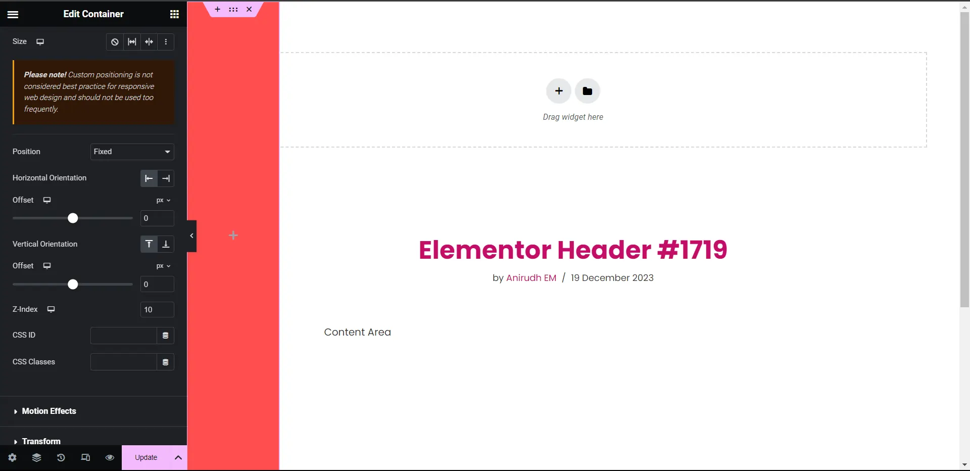
Add a container that will act as the parent container for our header.
Provide these properties to this container:
- Container Width : Full Width
- Margin : 0
- Padding : 0
- Gap : 0
- Height : 100 vh
- Position : Fixed
- Z – index : 10 (Or any other positive value but highest.)
These properties will help our vertical header be aligned with the screen wall and stick even when scrolling and on top of every element.
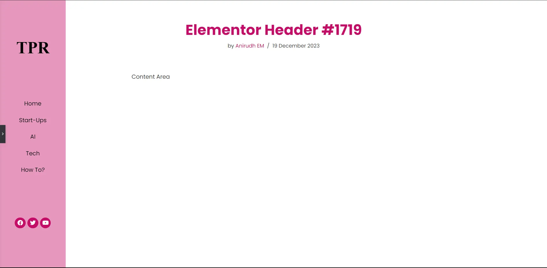
Add elements to your vertical header.
Now that you have a parent container, you can either add a new container for placing items, such as the logo, menu, social icons, search bar, etc. Once you have your container ready, provide a suitable “Justify Content” property so that your design will look good and have equal space between elements.
After adding the menu, make sure you change the layout from horizontal to vertical and give it proper spacing so that it will be responsive for both the tablet and PC.
In my design, I have added the logo, menu, and social icons for display on the vertical header with the “justify content: space-evenly” property.
Once you are done with the design, click “Publish” and add conditions for your header.
3. Using a single-post template for structural fixes.
Now our vertical header is almost complete, except for a little problem. My header is overlapping my content, due to which the design is disoriented. Relax; disorientation is caused by the “position: fixed” property we used in our header. Remember the warning elementor displayed?
Please note! Custom positioning is not considered best practice for responsive web design and should not be used too frequently.
Well, it was for our good. The reason it is happening is because when we assign z-index: 10 and position: fixed, our header floats above all the elements that are present on our page, and it occupies the default space for the page/post data display layout.
In order to fix this, we have to assign a new value for the page/post display layout using the theme builder.
Visit theme builder again, select single-page section, and create a new template. Once you get a blank canvas for design, select a container and provide these properties to this container:
- Container Width : Full Width
- Margin : 0
- Padding : 0
- Gap : 0
- Height : 100 vh
Just like in the header section, this will act as a parent container for our single-page template. Add two more containers inside the parent container with “content width: full-width.” Our first container will have the same width as the header, in this case, 12%, and the other container will get 88% (100–12). Now for the last step, search for “post content” in the elements section and place it in second container with 88% width.
Now, we have successfully created a vertical header in WordPress using elementor.
Is a vertical header in WordPress responsive for mobile views?
No, unfortunately, vertical header designs are not mobile-friendly as they tend to occupy screen space for devices like mobile and small Androids. A simple solution for mobile responsiveness is to create another design for mobile using elementor’s responsive settings in designing mode.
Please share your thoughts in the comments. At The Product Recap we are open to friendly suggestions and helpful input to keep awareness at its peak.